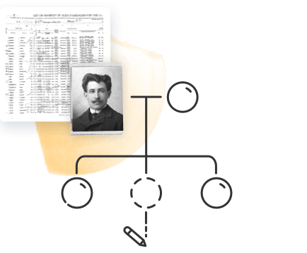
As you build your family tree and add more and more relatives, the relationships on your tree are likely to become more and more complex. Even if you’ve managed to master the convoluted system of cousin relationship terminology, you still may find it difficult to remember exactly how a particular distant family member is related to you or to someone else in your family — let alone explain it to someone else!
It’s much easier to understand relationships when you chart them out visually. The purpose of the traditional family tree chart is to help visualize the connections between family members. However, that chart will become more unwieldy and difficult to follow as its branches spread.
For this reason, MyHeritage offers a few free, simple ways to visualize the relationships between people in your family tree more easily: the relationship report feature, relationship diagrams, and color coding.
Relationship report
The free relationship report feature allows you to generate diagrams for any relationship between two individuals in your family tree (provided you are associated with it). Relationship reports can be especially useful to take along to family reunions or when interviewing an older family member.
To access the relationship report feature, hover over the “Family tree” tab in the navigation bar on your family site, click “More” at the bottom of the menu, and select “Relationship report” from the extended menu.

On the relationship report page, simply begin typing the names of the individuals whose relationship you wish to view in the “Person 1” and “Person 2” boxes and select them from the list that appears. A chart will appear below detailing the relationship step by step:

Your name will appear in the “Person 1” box by default. To choose someone else, hover over the box and click the X that appears.

By default, only the basic details of the individuals on the chart will be displayed. You can choose to display more details by opening the Details menu on the upper right and selecting “Full” instead of “Basic.” The full detail view includes each person’s places of birth and death in addition to their dates of birth and death.
Click the download icon on the upper right to save the diagram to your computer as a PDF file. This makes it convenient to share the file via email. You can also print the chart by clicking the print icon.

Accessing relationship diagrams from your family tree
You can also access a relationship diagram charting your relationship to a given relative directly from their profile panel when viewing your family tree (again, provided you are associated with the tree). When you open their profile panel, their relationship to you appears below their name, underlined with a dotted line. Simply click it to open the relationship diagram.

A pop-up appears displaying the diagram:

You can print this chart by clicking the printer icon on the top right corner. Clicking the pencil icon takes you to the Relationship report feature, which we’ll explore below.
Color coding
Color coding displays the direct ancestors of each branch of your family tree in a different color. This allows you to understand at a glance what side of the family a given ancestor is on.
Color coding is available on the Family view and Pedigree view of your family tree, applied to the family tree you’re associated with. The color scheme remains consistent through Fan view and the Family Tree Timeline as well:
- Blue: paternal grandfather’s side
- Green: paternal grandmother’s side
- Red: maternal grandfather’s side
- Yellow: maternal grandmother’s side
- Purple: your descendants

To enable color coding, click the palette icon on the lower right side of the screen. A pop-up will appear including a legend describing which color is assigned to each branch in the tree. Click the checkbox at the bottom of the pop-up to enable color coding for this family tree view.

You can also enable color coding on the mobile version of the MyHeritage website. When visiting your tree on mobile web, tap the settings icon on the upper right corner and select the “Use color coding” option.